The Chowen Labs
Design Language
A cohesive system of visual and interaction principles for building premium iOS and web experiences. Thoughtful, refined, and distinctly ours — built from the ground up on the Chowen Labs identity.
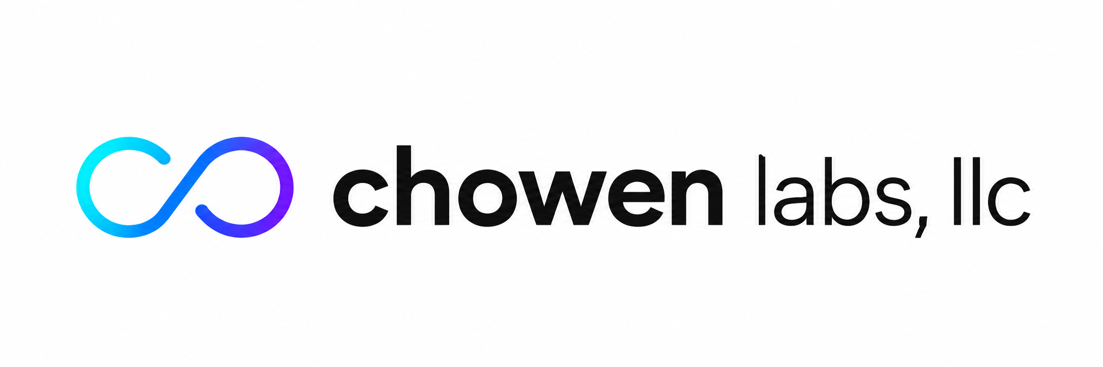
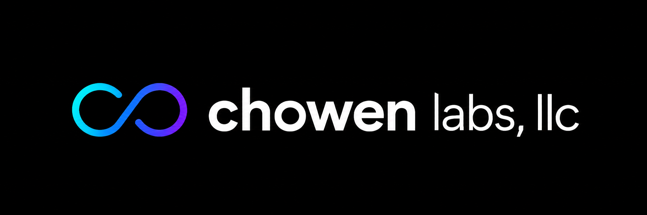
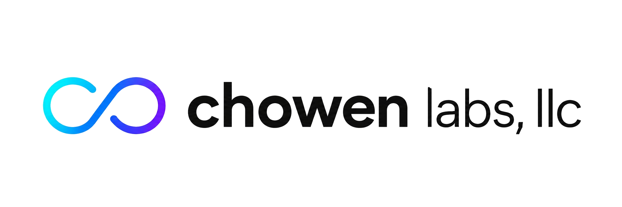
Logo
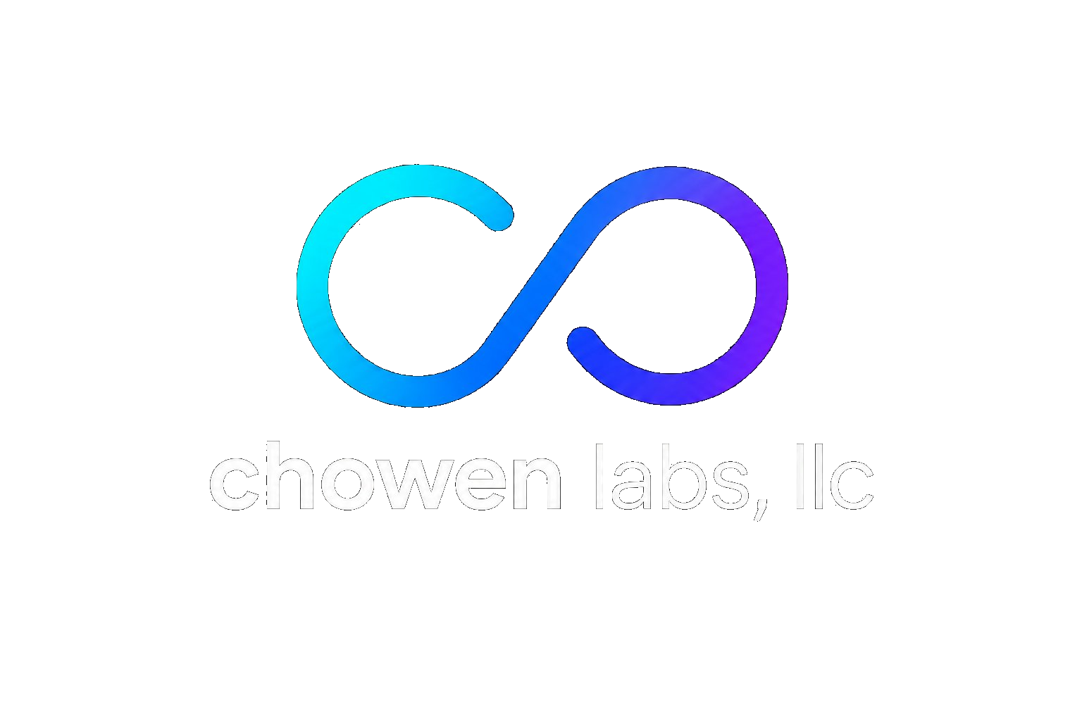
The Chowen Labs mark is an infinity symbol that forms the initials C + O — a nod to Charlie and Owen, and a metaphor for continuous creation. The gradient flows from cyan energy to deep indigo purpose.
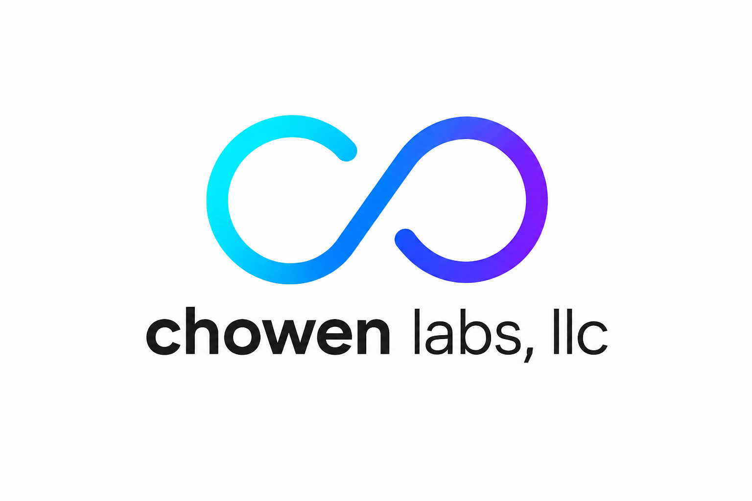
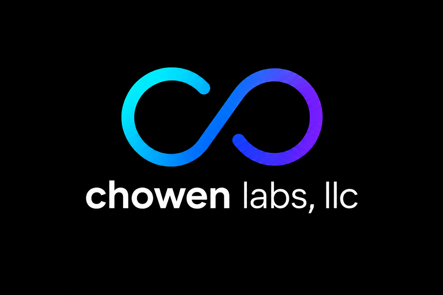
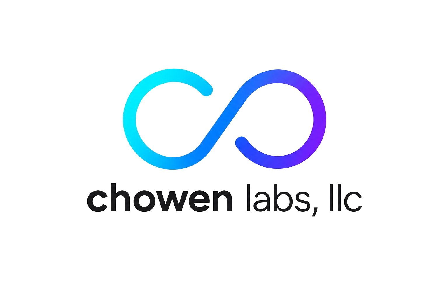
Maintain minimum clear space equal to the cap-height of "c" on all sides of the mark. Never crowd the logo against other elements.
Use the transparent versions whenever you control the background. Fall back to solid-BG versions only for third-party placements or print where background is unknown.
Never recolor, stretch, rotate, or apply effects to the mark. Never place it on busy backgrounds without a scrim or solid backing.
Color System
Three brand colors plus a gradient are the heart of the palette. The gradient should feel special — used for primary CTAs and brand moments, never as a background wallpaper. All surfaces and text adapt between light and dark.
Surfaces in dark mode use a cool-tinted near-black (not pure #000000) so the brand gradient retains its vibrancy and pops against the background.
Typography
Three typefaces form the Chowen Labs type system. Nunito anchors brand identity — its rounded geometry echoes the logo mark. DM Sans handles all UI work cleanly. JetBrains Mono for every technical surface.
Headings, app names, marketing copy, hero titles. Matches the warmth and roundness of the logo mark.
All body copy, labels, UI controls, captions. Highly legible at 11px+. Refined and friendly at small sizes.
Mono
Code, hex values, version numbers, token names, data displays, airport codes, tail numbers.
Spacing Scale
An 8-point base grid. All spacing decisions — padding, margin, gap — must snap to these values. This creates visual rhythm and predictable density across every surface and app.
Never use arbitrary pixel values. If you need 14px, use 16px (space-4). When in doubt, go larger — generous spacing reads as premium.
Elevation & Shadows
Four shadow levels create spatial depth. In light mode, shadows do the heavy lifting. In dark mode, lean on background level changes (--bg vs --bg-card vs --bg-elevated) as the primary depth cue — shadows carry less weight on dark surfaces.
Base surface
Inline cards
Standard depth
Floating panels
Brand glow
Border Radius
Consistent rounding reinforces the brand's rounded character. Scale corner radius to element size — smaller elements get tighter radii, larger surfaces get more generous curves. Never use sharp 0px corners.
Inline tags
Inputs, rows
Small cards
Cards, sheets
Hero cards
Buttons, badges
In SwiftUI, map these to: .cornerRadius(4/8/12/16/24) or .clipShape(RoundedRectangle(cornerRadius: X, style: .continuous)) for the smoothest Apple-quality curves.
Motion & Animation
Motion should feel natural and purposeful. Use spring curves for interactive elements — the overshoot communicates physical responsiveness. Reserve linear for instant toggling. Never animate for decoration alone.
350–450ms
Interactive elements: buttons, cards, icons. Slight overshoot adds personality. In SwiftUI: .spring(response: 0.4, dampingFraction: 0.6)
200–300ms
State transitions: color, opacity, background changes. Smooth entry and exit. In SwiftUI: .easeInOut(duration: 0.25)
100–150ms
Immediate feedback: toggles, checkboxes, selection highlight. Should feel instant — avoid perceptible delay. In SwiftUI: .linear(duration: 0.1)
Accessibility: always respect prefers-reduced-motion. Wrap all non-essential animations in @media (prefers-reduced-motion: no-preference) in web, or withAnimation(nil) fallbacks in SwiftUI.
Components
Core UI primitives built on the token system above. Every component supports both light and dark mode natively. These are the building blocks of every Chowen Labs app and surface.
Primary button always uses the brand gradient. Secondary is outlined. Ghost is borderless. Destructive uses the error color.
Voice & Tone
Chowen Labs is a craftsperson, not a corporation. Our voice is precise, warm, and confident. We write like a skilled pilot explaining a procedure — technically exact, but never cold or bureaucratic.
✗ "The ultimate all-in-one aviation companion experience"
✗ "Error 404: Resource not found."
✗ "We hope you might possibly enjoy this app."
✗ "Success! Operation completed."
Use sentence case everywhere except brand names and app titles. Write active voice. Use contractions (it's, you're, we've) to sound human. Lead with the benefit, not the feature.
Don't overuse exclamation points — one per screen maximum. Avoid buzzwords: "leverage," "seamless," "innovative," "robust." Never ALL CAPS for emphasis. Don't write error messages that blame the user.
Built for Charlie, Owen, and every app we haven't made yet.